Content Manager Documentation
This documentation showcases each component and the varieties that it’s able to achieve. Every component has its settings (colours, themes, font size, etc) that could be adjusted according to your needs.
P.S. Any theme that are not mentioned in this documentation is currently unused, unless they’re needed for future improvements. Choosing these themes won’t break the page - just produces plain style.

Brand Color
#dcdaf1
Accent
#f8f8f9
Secondary
#ffffff
Light
#53367a
Dark
#dcdaf1
Accent
Text Primary
#4a4a49
Text Secondary
#737b7d
Text Light
#ffffff
Text Dark
#523579
Text Accent
#8a85bf
Banners
Animated Banner
This is the new animated banner showcase.
Banner - Theme 1
This is banner - theme 1.
Remember that even after you choose a theme, you can still style any banner sub-items (paragraph, buttons, background) however you need it to be, with the size and colors provided.

Banner - Theme 2
This is banner - theme 2.
Example: 50% (narrower) content, with sleek bottom border. Great for when you need a divider for the next section. And if the text appears smaller, maybe it’s because the paragraph is set into “small”. Try it yourself! ?

Banner - Theme 2
This is banner - theme 2.
Example: 50% (narrower) content, with sleek bottom border. Great for when you need a divider for the next section. And if the text appears smaller, maybe it’s because the paragraph is set into “small”. Try it yourself! ?

Banner - Theme 3
This is banner - theme 3.
Banner theme-3 in small size font
Lorem ipsum dolor sit amet, consectetur adipiscing elit, sed do eiusmod tempor incididunt ut labore et dolore magna aliqua. Ut enim ad minim veniam, quis nostrud exercitation ullamco laboris nisi ut aliquip ex ea commodo consequat.
Banner - Theme 4
Lorem ipsum dolor sit amet, consectetur adipiscing elit, sed do eiusmod tempor incididunt ut labore et dolore magna aliqua. Ut enim ad minim veniam, quis nostrud exercitation ullamco laboris nisi ut aliquip ex ea commodo consequat.
Banner - Theme 4
Lorem ipsum dolor sit amet, consectetur adipiscing elit, sed do eiusmod tempor incididunt ut labore et dolore magna aliqua. Ut enim ad minim veniam, quis nostrud exercitation ullamco laboris nisi ut aliquip ex ea commodo consequat.
Banner - Theme 5
Lorem ipsum dolor sit amet, consectetur adipiscing elit, sed do eiusmod tempor incididunt ut labore et dolore magna aliqua. Ut enim ad minim veniam, quis nostrud exercitation ullamco laboris nisi ut aliquip ex ea commodo consequat.
Content Blocks
Content Block - Theme 1
This is Content Block - Theme 1.
Content blocks are essentially contents in columnal layout. You can choose from two up to 5 columns, and all of them can be styled with any theme that you need. For example, this is theme 1.
The theme 1 content block is more focus on the originality layout of Dory’s Ocean with some padding
This is the text in small size
This is the footnote in extra small size
Content Block - Theme 2
This is content block theme 2.
Aligned in left
- Has narrower gaps from each column and to each item in the column
- Has wider gap to the section before and after
- Recommended to add column background color; it’s styled to have rounded corners
Please refer to other themes as a comparison.
Content Block - Theme 2
This is content block theme 2.
Aligned in right
- Has narrower gaps from each column and to each item in the column
- Has wider gap to the section before and after
- Recommended to add column background color; it’s styled to have rounded corners
Please refer to other themes as a comparison.
Content Block - Theme 3
This is content block theme 3.
- Has wider gaps from each column and to each item in the column
- Has narrower gap to the section before and after
Please refer to other themes as a comparison.
Content Block - Theme 3
This is content block theme 3.
- Has wider gaps from each column and to each item in the column
- Has narrower gap to the section before and after
Please refer to other themes as a comparison.
Content Block - Theme 3

This is content block theme 3.
- Has wider gaps from each column and to each item in the column
- Has narrower gap to the section before and after
Please refer to other themes as a comparison.
Content Block - Theme 4
This is content block theme 4.
- Recommended to add column background color; it’s styled to have rounded corners (border style, not filled)
- Image will animate on hover when there’s link associated to it
Content Block - Theme 4
This is content block theme 4.
- Recommended to add column background color; it’s styled to have rounded corners (border style, not filled)
- Image will animate on hover when there’s link associated to it
Content Block - Theme 4
This is content block theme 4.
- Recommended to add column background color; it’s styled to have rounded corners (border style, not filled)
- Image will animate on hover when there’s link associated to it
Content Block - Theme 4
This is content block theme 4.
- Recommended to add column background color; it’s styled to have rounded corners (border style, not filled)
- Image will animate on hover when there’s link associated to it
Lorem ipsum dolor sit amet, consectetur adipiscing elit, sed do eiusmod tempor incididunt ut labore et dolore magna aliqua. Ut enim ad minim veniam, quis nostrud exercitation ullamco laboris nisi ut aliquip ex ea commodo consequat.
Lorem ipsum dolor sit amet, consectetur adipiscing elit, sed do eiusmod tempor incididunt ut labore et dolore magna aliqua. Ut enim ad minim veniam, quis nostrud exercitation ullamco laboris nisi ut aliquip ex ea commodo consequat.
Lorem ipsum dolor sit amet, consectetur adipiscing elit, sed do eiusmod tempor incididunt ut labore et dolore magna aliqua. Ut enim ad minim veniam, quis nostrud exercitation ullamco laboris nisi ut aliquip ex ea commodo consequat.
Video in ContentBlock
Video in ContentBlock
Video in ContentBlock
Buttons
Buttons - Small Size
Buttons - Medium Size
Buttons - Large Size
Typography
Heading - Extra Large
This is the medium text size. You can use it as a paragraph. You can also configure the the section height to adjust your padding between section.
Settings:
- Heading - Extra Large
- Paragraph - Medium
- Section Height - Small
- Theme - 1
Heading Large
This is the small text size. You can use it as a paragraph. You can also configure the the section height to adjust your padding between section.
Settings:
- Heading - Large
- Paragraph - Small
- Section Height - Medium
- Theme - 2
Heading Medium
This is the extra small text size. You can use it as a paragraph. You can also configure the the section height to adjust your padding between section. This theme comes with Border Bottom.
Settings:
- Heading - Medium
- Paragraph - Extra Small
- Section Height - Large
- Theme - 3
Primary Color
Heading Extra Small
Heading Small
Heading Medium
Heading Large
Heading Extra Large
Secondary Color
Heading Extra Small
Heading Small
Heading Medium
Heading Large
Heading Extra Large
Accent Color
Heading Extra Small
Heading Small
Heading Medium
Heading Large
Heading Extra Large
Dark Color
Heading Extra Small
Heading Small
Heading Medium
Heading Large
Heading Extra Large
And this is how a regular paragraph looks like. You can also adjust the sizing and the colors too, just like the heading ones. This paragraph using a dark color.
This is extra small size, accent color
This is small size, primary color
This is medium size, secondary color
This is large size, accent color
This is extra large size, primary color
Text Block
Textblock - One Content Column Layout
Lorem ipsum dolor sit amet, consectetur adipiscing elit, sed do eiusmod tempor incididunt ut labore et dolore magna aliqua. Ut enim ad minim veniam, quis nostrud exercitation ullamco laboris nisi ut aliquip ex ea commodo consequat.
And this is how a regular paragraph looks like. This paragraph using default text color.
We have list:
- List 1
- List 2
Plain Link
Textblock - Two Content Column Layout
Lorem ipsum dolor sit amet, consectetur adipiscing elit, sed do eiusmod tempor incididunt ut labore et dolore magna aliqua. Ut enim ad minim veniam, quis nostrud exercitation ullamco laboris nisi ut aliquip ex ea commodo consequat.
And this is how a regular paragraph looks like. This paragraph using default text color.
We have list:
- List 1
- List 2
Plain Link
You can also create table using html table 🤩
Accordion
Ut enim ad minim veniam, quis nostrud exercitation ullamco laboris nisi ut aliquip ex ea commodo consequat.
- Sed ut perspiciatis unde omnis iste natus error sit voluptatem accusantium doloremque laudantium
- Totam rem aperiam, eaque ipsa quae ab illo inventore veritatis
- Et quasi architecto beatae vitae dicta sunt explicabo
Quis autem vel eum iure reprehenderit qui in ea voluptate velit esse quam nihil molestiae consequatur, vel illum qui dolorem eum fugiat quo voluptas nulla pariatur
- Nemo enim ipsam voluptatem quia voluptas sit aspernatur aut odit aut fugit, sed quia consequuntur magni dolores eos qui ratione voluptatem sequi nesciunt.
- Neque porro quisquam est, qui dolorem ipsum quia dolor sit amet, consectetur, adipisci velit, sed quia non numquam eius modi tempora incidunt ut labore et dolore magnam aliquam quaerat voluptatem.
- Ut enim ad minima veniam, quis nostrum exercitationem ullam corporis suscipit laboriosam, nisi ut aliquid ex ea commodi.

Lorem ipsum dolor sit amet, consectetur adipiscing elit, sed do eiusmod tempor incididunt ut labore et dolore magna aliqua. Ut enim ad minim veniam, quis nostrud exercitation ullamco laboris nisi ut aliquip ex ea commodo consequat.
Duis aute irure dolor in reprehenderit in voluptate velit esse cillum dolore eu fugiat nulla pariatur. Excepteur sint occaecat cupidatat non proident, sunt in culpa qui officia deserunt mollit anim id est laborum.
Yes you can. Just toggle to the “columns” option and choose “two”. Voila!
- Blanditiis praesentium voluptatum deleniti atque corrupti quos dolores et quas molestias
- Excepturi sint occaecati cupiditate non provident, similique sunt in culpa qui officia deserunt mollitia animi
- Id est laborum et dolorum fuga. Et harum quidem rerum facilis est et expedita distinctio
- Nam libero tempore, cum soluta nobis est eligendi optio cumque nihil
- Impedit quo minus id quod maxime placeat facere
- Sed ut perspiciatis unde omnis iste natus error sit voluptatem accusantium doloremque laudantium, totam rem aperiam, eaque ipsa quae ab illo inventore veritatis et quasi architecto beatae vitae dicta sunt explicabo. Nemo enim ipsam voluptatem quia voluptas sit aspernatur aut odit aut fugit
- Sed quia consequuntur magni dolores eos qui ratione voluptatem sequi nesciunt. Neque porro quisquam est, qui dolorem ipsum quia dolor sit amet, consectetur, adipisci velit, sed quia non numquam eius modi tempora incidunt ut labore et dolore magnam aliquam quaerat voluptatem
This is accordion theme 2 extra large text size
Video Embed
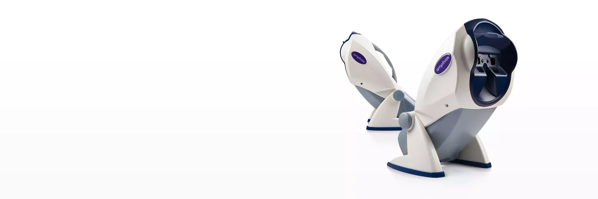
Product Cards Section
Product Cards Theme 1
- This is the default theme
- You can put space if you don’t want the title to be displayed.
- Refer to this page on the implementation
Our Products
View All
Product Cards Theme 3
- This is the Product Cards Theme 3
- This theme hide the Heading and View More button.
- The card size is in Flex. So it will full span width.
- Refer to this page on the implementation
Our Products
Article Cards Section (for Blogs)
Articles Theme 1
- This is the default theme for Articles Theme 1
Related posts
View All Articles

Articles Theme 2
- This theme is to have View All button after the articles list. Refer to page education
Related posts
View All ArticlesArticles Theme 3
- Configured to only show first 3 articles in the listing.
- Title is in the middle.
- Refer to the example article on implementation.
Article Cards Theme 3 - Select up to 3 articles
View All ArticlesArticles Theme 4
- This theme is to make the layout display in list of 3.
- Title is in the middle.
- Mainly same as Theme 3, just the backgroud
- Refer to the example article on implementation.
Article Cards Theme 4 - Select up to 3 articles -Without Grey Background
View All ArticlesForms
Form - Theme 1
- Plain form with minimal styling & config
Form - Theme 2
- This form has a configuration to make it collapse into a button on pageload
- Automatically applies secondary background color into it
- Right now the “Request A Quote” button is not customizable
Gallery
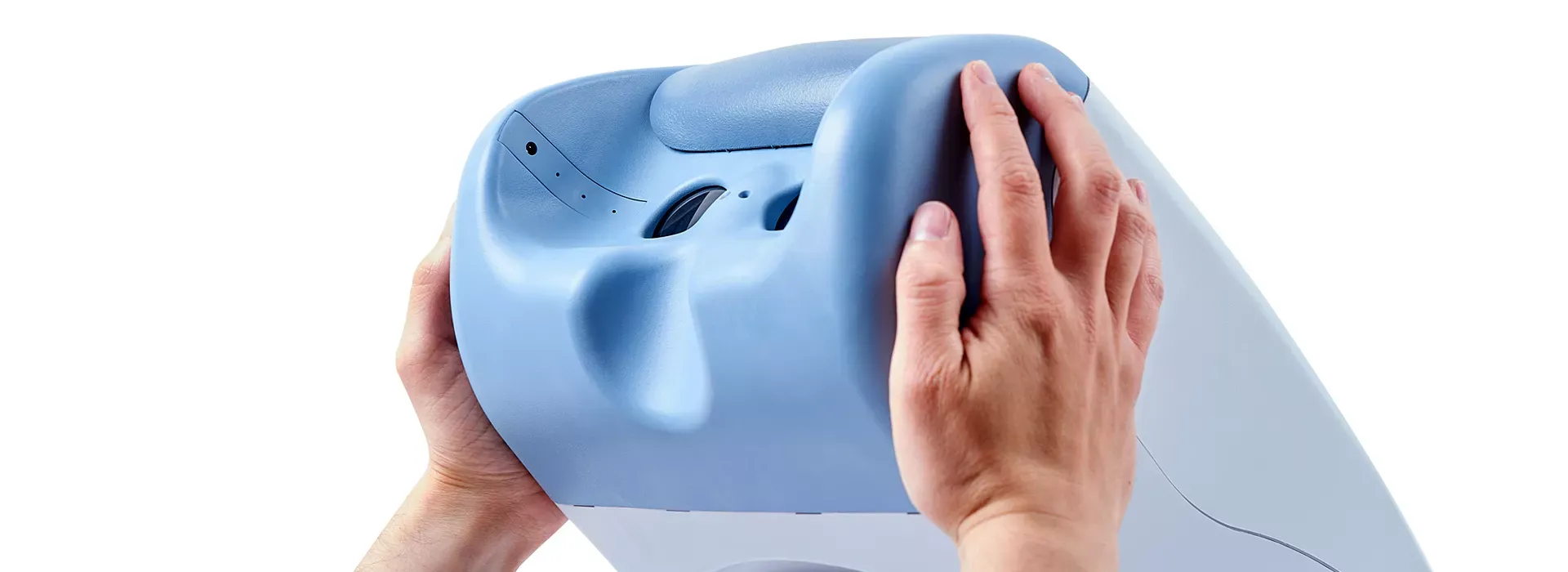
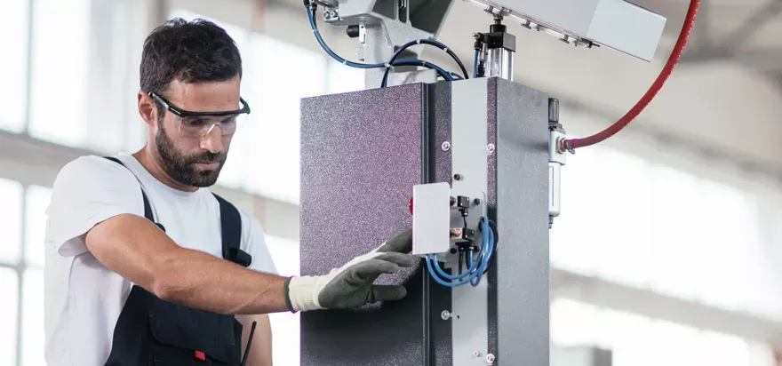
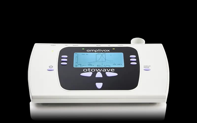
Single Photo
Use when gallery only have 1 photo added
Office Maps
Almukhlis Hearing Center
Palestine Street
Jeddah, N/A
E-mail: Info@mhc-sa.com
Phone: 0590155418
Ibn Al Haytham Centre
Al Mirqab St
Doha, Fereej Al Nasr Po Box 9958
Qatar
Phone: +974 4438 0115
E-mail: purchase@ibncentre.com
WebsiteAudiocare AG
Eichenweg 1
Liestal CH-4410
Switzerland
Phone: +41 61 463 0990
E-mail: s.mueller@audiocare.ch
WebsiteQuality Medical Business
2ème étage, Centre El Menazeh Medical, 4 Rue Ammar Ibn Yasser، Ariana 2091
Ariana N/A
Tunisia
Phone: +216 22 370 005
E-mail: ahmedbelhaj@qmbtunisia.com
WebsitePerino Group
Estrada Nacional 249-3, Cacém Park, Alto Da Bela Vista Arm. 1 Cacém
Lisboa, Lisboa (Lisbon District) 2735-307
Portugal
E-mail: antoniopinheiro@thl.pt
Nozha Trading Organization
152, Nozha Avenue, Heliopolis 11361
Cairo, Cairo Governorate 11361
Egypt
Phone: +20-2 27752613
E-mail: bhakim@nozhatrading.com.eg
WebsiteWidex Egypt
2A El-Noor bulding project, Naser City
Cairo, Cairo Governorate N/A
Egypt
Phone: +201 2 344 1117
E-mail: widexegypt@gmail.com
WebsiteUtano Africa Pvt Ltd
25 Lawson Avenue Milton Park
Harare, Harare Province 0002
Zimbabwe
Phone: +263 242 709030
E-mail: calvin@utanoafrica.com
WebsiteCIMS
House 1, Trans Amadi Gardens, 32 Road, X Close, off Peter Odili Road
Port Harcourt, Rivers State 500101
Nigeria
Phone: +234 7041300007
E-mail: operations@cimsmedicals.com
WebsiteDemant Belgium
Technologielaan 3
Leuven, Flemish Brabant B-3001
Belgium
Phone: +32 16 93 01 80
E-mail: kiqu@demant.com
Lapperre
Spoorwegstraat 22
Groot-Bijgaarden, Flemish Brabant B-1702
Belgium
Phone: +32 2 700 77 14
E-mail: byrthe.voortmans@lapperre.be
WebsiteLEDISO Italia Srl
Via Panciatichi, 94/20
Firenze, Tuscany 50127
Italy
Phone: +39 055 4288392
E-mail: info@lediso.it
WebsiteD.O.S Co. Ltd
Qanat Street, District 207, Street 1, House 6
Sulaimaniah, Sulaymaniyah Governorate N/A
Iraq
Phone: +964 750 448 7433
E-mail: dos_company37@yahoo.com
Diatec Korea
602, 6 Floor, SEOYUNG B/D,99, Seosomuen-ro, Jung-gu
Seoul, Seoul N/A
Korea (South Korea)
Phone: +82 (0)2 2022 3951
E-mail: cepa@interacoustics.com
WebsiteMuscat Pharmacy & Stores LLC
P.O. Box. 438
Muscat, Muscat Governorate 100
Oman
Phone: +968 99416795
E-mail: shibin@mpmct.com
WebsiteVolume Hearing Aid Center P.L.C.
Hedna Building, 3rd Floor, Gabon St.
Addis Ababa, Addis Ababa P.O. Box - 145005
Ethiopia
Phone: +251911565653
E-mail: volumehearing@gmail.com
WebsiteE.J. Busuttil Limited
usuttil Buildings, Triq l-Għadam, Central Business District Zone 1
Birkirkara, Central Region CBD1060
Malta
Phone: +356 21447184
E-mail: busuttilc@ejbusuttil.com
WebsiteNs Clinical Tech Pty Ltd
76 Jasper Avenue, Doringkloof, Pretoria
Pretoria, Gauteng 0157
South Africa
Phone: +27 076 323 2132
E-mail: stefan@nsclinical.co.za
WebsiteNavitrons Pty Ltd
275 Sparks Rd, Durban, KwaZulu-Natal
Durban, KwaZulu-Natal 4091
South Africa
Phone: +27-74 6144 657
E-mail: info@navitrons.com
WebsiteHASS Group
1237 Webb Rd, Queenswood
Pretoria, Gauteng 0186
South Africa
Phone: +27 (12) 021-0131
E-mail: bennie@hass.co.za
WebsiteDemant Nederland B.V.
Singaporestraat 70
RA Lijnden, North Holland 1175
Netherlands
Phone: +31 62335723
E-mail: nkem@diatec-diagnostics.nl
Diatec France
17, Avenue des Louvresses, Batiment A1
Gennevilliers, Île-de-France 92230
France
Phone: +33 1 41 43 23 20
E-mail: fivi@diatec-diagnostics.fr
Sonova Israel Ltd
Netiv Ha'or 1
Haifa, Haifa District 3508510
Israel
Phone: +972 545350702
E-mail: adi.valensi@sonova.com
MEGA MEDİCAL TIBBİ MALZEME TİCARET LİMİTED ŞİRKETİ
Brandium Residence, R5 Blok D:101 Küçükbakkalköy Mah. Dereboyu Caddesi, Ataşehir
Istanbul, Istanbul 34750 (Ataşehir area)
Turkey
Phone: +90 546 510 66 45
E-mail: info@mega-medical.com
Duyumed İşitme Cihazları A.Ş.
Fulya Mh. Büyükdere Cd. No: 74A Torun Center İç Kapı: 103
Şişli/İstanbul 34394
Turkey
Phone: +90 212 912 36 36
E-mail: info@duyumed.com
WebsiteWarner Tech-care Products, LLC
3796 Dunlap St N
Arden Hills, MN (Minnesota) 55112
United States of America
Phone: 800-328-4757
E-mail: info@warnertechcare.com
WebsiteTelemetrics Corp
P.O. Box 129, 9300 Hwy 27 North
Rock Spring, GA (Georgia) 30739
United States of America
Phone: 800 523-8583
E-mail: bruce@telemetricscorp.com
WebsiteSPA Associates, LLC
470 Olde Worthington Rd, Suite 200
Westerville, OH (Ohio) 43082
United States of America
Phone: 614 777 8399
E-mail: sales@spaassociates.com
WebsiteSchool Nurse Supply
1745 Wallace Ave
St. Charles, IL (Illinois) 60174
United States of America
Phone: 800 485 2737
E-mail: customerservice@schoolnursesupply.com
WebsiteR-B Instruments
15219 Ringfield Dr
Houston, TX (Texas) 77084
United States of America
Phone: 800 533 7234
E-mail: robert@r-binstruments.com
WebsiteProTek Instruments
20494 Fern Ridge Rd
Stayton, OR (Oregon) 97383
United States of America
Phone: 800 232 5552
E-mail: sales@protekinstruments.com
WebsitePC Occupational Solutions
10013 Zig Zag Rd
Cincinnati, OH (Ohio) 45242
United States of America
Phone: 513 926 1948
E-mail: pc@pcoccsol.com
WebsiteOaktree Products, Inc
610 Spirit Valley East Drive
Chesterfield, MO (Missouri) 63005
United States of America
Phone: 800 347 1960
E-mail: otp@oaktreeproducts.com
WebsiteMidwest
615 6th St SE
Watertown, SD (South Dakota) 57201-4938
United States of America
Phone: 800 657-8098
E-mail: paul.johnson@midwestmedsd.com
WebsiteMEDI
4814 E. Second St.
Benicia, CA (California) 94510
United States of America
Phone: 707-746-6334
E-mail: info@medi6334.com
WebsiteMedical Resources
8377 C Green Meadows Drive North
Lewis Center, OH (Ohio) 43035
United States of America
Phone: 800-860-4716
E-mail: inquiries@medicalresources.com
WebsiteMedical Device Depot
6910 W Ridge Rd
Fairview, PA (Pennsylvania) 16415
United States of America
Phone: 1-877-646-3300
E-mail: customerservice@medicaldevicedepot.com
WebsiteMcKesson
6555 State Highway 161
Irving, TX (Texas) 75039
United States of America
Phone: 800.422.0280
E-mail: customerservice@mckesson.com
WebsiteLipin / Dietz Associates Inc.
8 Milo Peck Lane
Windsor, CT (Connecticut) 06095
United States of America
Phone: 203 453-8888
E-mail: jrich@lipindietz.com
WebsiteInstrumentation Associates, Inc
88 Glocker Way #352
Pottstown, PA (Pennsylvania) 19465
United States of America
Phone: 610 992-3300
E-mail: sales@instrumentationassoc.com
WebsiteHenry Schein
135 Duryea Road
Melville, NY (New York) 11747
United States of America
Phone: 1-800-772-4346
E-mail: medsls@henryschein.com
WebsiteHenan Medical
8276 NW 68th St
Miami, FL (Florida) 33166
United States of America
Phone: 305 599 0204
E-mail: sales@henanmedical.com
WebsiteEatern Acoustics
1889 Route 9 Unit 97
Toms River, NJ (New Jersey) 08755
United States of America
Phone: 848-444-0339
E-mail: sales@easternacoustics.com
WebsiteCrystal Clear Audio Medical Inc
4242 SE 18th Court
Gresham, OR (Oregon) 97080
United States of America
Phone: 503-816-4133
E-mail: timtservice@gmail.com
Audiology Calibration Specialists
65 W. Street Road
Warminster, PA (Pennsylvania) 18974
United States of America
Phone: 215-443-5368
E-mail: acshelp@verizon.net
Audiology Assistant Sales & Service
1792 S Lake Dr Ste 90
Lexington, SC (South Carolina) 29073
United States of America
Phone: 631-247-6916
E-mail: sales@audiologyassistant.com
WebsiteAlcopro / Kahntact
1626 Downtown W Blvd
Knoxville, TN (Tennessee) 37919
United States of America
Phone: 800-227-9890
E-mail: info@alcopro.com
WebsiteAcoustiComm
13406 Seymour Myers Dr
Covington, LA (Louisiana) 70433
United States of America
Phone: 985-893-2200
E-mail: lee@acousticomm.com
WebsiteUtano Africa Pvt Ltd
25 Lawson Avenue Milton Park
Harare N/A
Zimbabwe
Phone: 263243000000
E-mail: calvin@utanoafrica.com
WebsiteSonova Israel Ltd
Haifa Life Sciences Park, 1 Netiv Ha'Or St
Haifa, Haifa District 3508510
Israel
Phone: +972 3 9034456
E-mail: adi.valensi@sonova.com
WebsiteMedu Norge As
Biskop Jens Nilssons Gate 5
Oslo 659
Norway
Phone: 4721095442
E-mail: post@skjervheimgruppen.no
WebsiteNs Clinical Tech Pty Ltd
76 Jasper Avenue, Doringkloof
Pretoria, Gauteng 157
South Africa
Phone: 27124607676
E-mail: selma@nsclinical.co.za
Navitrons Pty Ltd
275 Sparks Rd
Durban, KwaZulu-Natal 4091
South Africa
Phone: 27746144657
E-mail: info@navitrons.com
WebsiteMuscat Pharmacy LLC
P.O. Box. 438, P.C. 100
Muscat N/A
Oman
Phone: 00 968 24814501
E-mail: shibin@mpmct.com
WebsiteAl Mukhlis Hearing Center
Palestine Street, Mushrifah
Jeddah 23331
Saudi Arabia
Phone: 966 59 318 1115
E-mail: rahoof@mhc-sa.com
WebsiteMetro Health Technologies
16 Shaw Road #01-04
Singapore 367954
Saudi Arabia
Phone: (65) 6509 9279
E-mail: dannygoh@mge.com.sg
Medprix Trading Co.LLC
No.304 Bushaqer Block A
Dubai, Al Garhoud N/A
United Arab Emirates
Phone: 97142510313
E-mail: sooraj@medprix.ae
WebsiteMedvalley Trading LLC
Building No. 80, 1st Floor, Office No. 10, Thani Bin Jasim Street (St. No. 780)
Doha, Al Gharrafa (Zone 51) N/A
Qatar
Phone: 97441407877
E-mail: suhaib@medvalley-qa.com
WebsiteKing Pax Technology Company Ltd
7F-1, No 164 Fu-Xing N Rd
Taipei 10487
Taiwan
Phone: 886-2-2570-2085
E-mail: acoustics@kingpax.com.tw
WebsiteVietnam Kavido Investment & Technology
DEVELOPMENT JOINT STOCK COMPANY, 29 Giai Phong, Phuong Dong Tam
Hanoi, Quan Hai Ba Trung N/A
Vietnam
Phone: 0904777616
E-mail: flsa@oticon.com
Ibn Al Haytham Centre
Al Mirqab St
Doha Po Box 9958
Qatar
Phone: +974 4438 0115
E-mail: purchase@ibncentre.com
WebsiteAudio Medics
13-F Fatima Center 14-A Queen'S Road
Lahore 54000
Pakistan
Phone: 92 42 36360926
E-mail: chsarfraz@hotmail.com
Med House Health Care LLC
Gulhani 2-37
Tashkent, Tashkent N/A
Uzbekistan
Phone: +998998887111
E-mail: uzmed_house@mail.ru
Atomedika UAB
T. Kosciuskos g. 24
Vilnius, Vilnius County LT-01100
Lithuania
Phone: +37065781992
E-mail: kestutis@atomedika.lt
WebsiteOptima Trading LLC
12 Anton Tsedik St.
Kyiv 03057
Ukraine
Phone: +380952820396
E-mail: optimatrading2014@gmail.com
WebsiteMedPrix Trading Co. LLC
No. 304, Bushaqer Block A, GGICO Metro Exit 2, Al Garhoud
Dubai, Dubai N/A
United Arab Emirates
Phone: +971565647283
E-mail: sales@medprix.ae
WebsiteVK CENTR REABILITACII SLUHA LLC
Potanina Street 18
Ust'-Kamenogorsk, East Kazakhstan Region 070003
Kazakhstan
Phone: +7-707-793-91-00
E-mail: sale@yxo.kz
WebsiteDiatec NZ
Level 2, Building A, Millennium Centre, 600 Great South Road, Ellerslie
Auckland, Auckland 1051
New Zealand
Phone: +649279 8833
E-mail: info@diatec-diagnostics.co.nz
WebsiteDistribuciones Audiologicas SAS
Transversal 24 #53D-51
Bogotá, Bogotá D.C. N/A
Colombia
Phone: 3045481068
E-mail: distraudio.gerencia@gmail.com
WebsiteSILVHER SAS
Cl 53 #58-19, Barrio La Esmeralda
Bogotá, Bogotá D.C. N/A
Colombia
Phone: +573184936814
E-mail: gerenciaadmin@silvherltda.com
WebsiteNS Clinical Technologies (Pty) Ltd
76 Jasper Ave, Doringkloof
Centurion, Gauteng 0157
South Africa
Phone: 076 323 2132
E-mail: info@nsclinical.co.za
WebsiteEartistic Sdn. Bhd.
Block D-1-2, Encorp Strand Garden Office, No 12 Jalan PJU 5/1, Kota Damansara
Petaling Jaya, Selangor 47810
Malaysia
Phone: 60 11-3908 9107
E-mail: firdausali@eartistic.com.my
WebsiteSonic Equipment
629 Nudgee Road
Brisbane, QLD 4012
Australia
Phone: 1800 639 263
E-mail: adminequipment@soniceq.com
WebsiteCÔNG TY CỔ PHẦN ĐẦU TƯ VÀ PHÁT TRIỂN CÔNG NGHỆ KAVIDO VIỆT NAM
29 Giai Phong Street, Bach Mai Ward
Hanoi, Hanoi N/A
Vietnam
Phone: +84 24 730 26626
E-mail: kinhdoanh@trothinhchauau.vn
WebsiteJordan Hearing Center
11 Ilya Abu Madi Street, Shmeisani
Amman, Amman Governorate N/A
Jordan
Phone: 00962795605444
E-mail: info@hearingjo.com
WebsiteAlmukhlis Hearing Center
Palestine Street
Jeddah, Makkah Province N/A
Saudi Arabia
Phone: 0590155418
E-mail: Info@mhc-sa.com
WebsiteDiatec Sweden (Demant Sweden AB)
Löfströms Allé 5
Sundbyberg, Stockholm County 172 66
Sweden
Phone: 08-506 981 09
E-mail: info@diatecsweden.se
WebsiteCaures Healthcare Solutions
85 Luqa Road
Tarxien, Southern Region TXN 1093
Malta
Phone: +35627893002
E-mail: info@caureshearing.com
WebsiteLEDISO Italia Srl
Via Panciatichi, 94/20
Firenze, Toscana 50127
Italy
Phone: +39 055 4288392
E-mail: info@lediso.it
WebsiteMedu Norway AS
Biskop Jens Nilssøns gate 5
Oslo, Oslo 0659
Norway
Phone: 23 03 63 70
E-mail: post@medu.no
WebsiteAMTC Antipas
Street 356, Number 23
Nea Makri, Attica 19005
Greece
Phone: 0030-22940-99937
E-mail: info@amtc.gr
WebsiteNavitrons (Pty) Ltd.
275 Sparks Road, Overport
Durban, KwaZulu-Natal 4091
South Africa
Phone: +27 31 1000 457
E-mail: info@navitrons.com
WebsiteD.O.S Co. Ltd
H.6, Qanat Street, Dis, 1 207, St
Sulaymaniyah, KRG (Kurdistan Region) 46001
Iraq
Phone: +9647702465700
E-mail: dana.osman@dosgroup.org
WebsiteRing-In Trading Development Co., Ltd.
7F-2, No. 9, Po-Ai Rd
Taipei, Taipei 100
Taiwan
Phone: +886-2-23816767 ext. 22
E-mail: secretary@ring-in.com.tw
WebsiteAudiogroup Guatemala
6ta avenida 9-18, Edificio Sixtino 2, nivel 6, ala 2, oficina 605
Ciudad de Guatemala, Guatemala N/A
Guatemala
Phone: +502 3995 5374
E-mail: info.gt@aglatam.com
WebsiteAudiogroup Latam Costa Rica
Oficentro Momentum Pinares, Oficina 4-6
Curridabat, San José 11801
Costa Rica
Phone: +50686422484
E-mail: info@aglatam.com
WebsiteVitasons
Av. Cristóvão Colombo, 1577
Porto Alegre, RS (Rio Grande do Sul) 90560-025
Brazil
Phone: +55 51 2108.1900
E-mail: vitasons@vitasons.com.br
WebsiteSONIX
Dusko Bojkovski 4
Skopje, Skopje Region 1000
North Macedonia (Macedonia)
Phone: +38923179176
E-mail: info@sonix.com.mk
WebsiteAudiogroup Latam Panamá S.A
Pacific Center, Torre A, Piso 12, Oficina 1217, Calle Ramón H Jurado, Punta Pacífica
Ciudad de Panamá, Panamá 0816 (Punta Pacífica area)
Panama
Phone: +507 310 2441
E-mail: kdiaz@aglatam.com
WebsiteMegamed Medical Instruments Industry and Trade Ltd. Co.
Brandium Residence, R5 Blok D:101, Küçükbakkalköy Mah., Dereboyu Caddesi
İstanbul, İstanbul 34750 (Ataşehir area)
Turkey
Phone: +90 546 510 66 45
E-mail: info@mega-medical.com
WebsiteSOVA VID j.d.o.o.
F. Livadića 51
Zaprešić, Zagreb County 10290
Croatia
Phone: +385914488442
E-mail: info@sovavid.hr
Websiteemedicalbox
C/ Marqués de Santillana, 3, Local B
La Carlota, Córdoba 14100
Spain
Phone: +34957300910
E-mail: ventas@emedicalbox.com
WebsiteSlušni studio Botulja d.o.o.
Igmanskih bataljona 93
Sarajevo, Federation of Bosnia and Herzegovina 71210
Bosnia and Herzegovina
Phone: +387 33 867 549
E-mail: botulja.fahrudin@hotmail.com
WebsiteSociedad Electroaudical SPA
Román Díaz #205, Oficina 505
Santiago, Región Metropolitana de Santiago 7500618
Chile
Phone: +56 2 33052097
E-mail: contacto@electroaudical.cl
WebsiteDuyumed İşitme Cihazları A.Ş.
Fulya Mh. Büyükdere Cd. No: 74A, Torun Center, İç Kapı: 103
İstanbul 34394
Turkey
Phone: +90 212 912 36 36
E-mail: info@duyumed.com
WebsiteGuymark UK Ltd
Geneva House, International Park, Starley Way
Birmingham B37 7GN
United Kingdom
Phone: 01698 208238
E-mail: sales@guymark.com
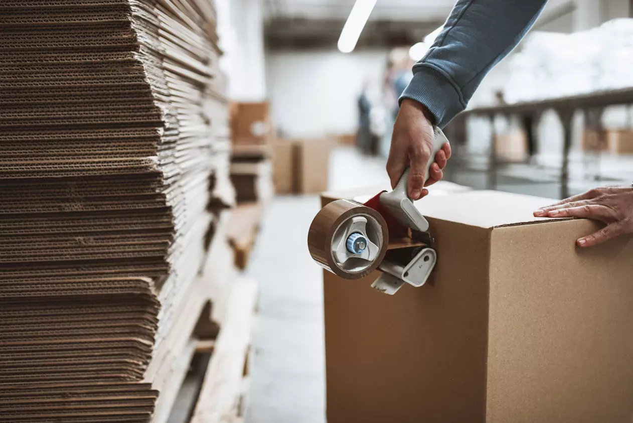
WebsiteMany Photos
Use when gallery have more than 1 photo added


TESTT
UPDATE: From the 5th May 2026, Amplivox courses will be deliverd by Diatec Diagnostics UK.